
Introduction
The Chrome team approached us with an open brief: explore how web navigation might evolve, and propose concepts that could one day become web standards. The challenge was clear – ideas had to feel new, but still be realistic enough to build on top of existing platform capabilities.
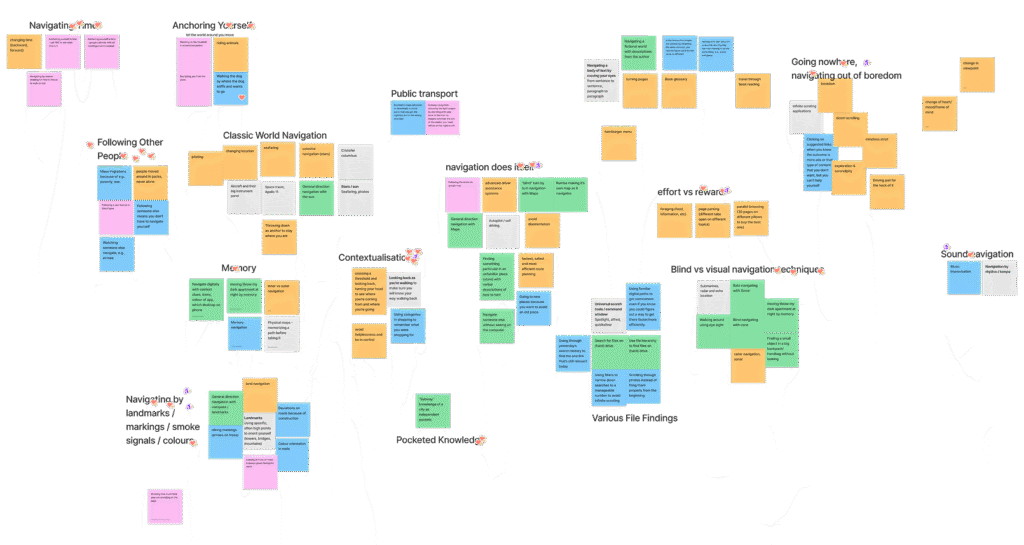
Initial exploration session. Early in the project, we explored metaphors and mental models of navigation — from seafaring and GPS to memory, autopilot, and social behaviors — to broaden our understanding of how people move through digital spaces.
Our initial explorations missed the mark. They focused too much on the browser itself – tab grouping, history visualizations, and extensions. After early feedback, we shifted focus and framed new ideation around a set of “how might we” questions aimed more squarely at empowering developers.
How might we empower developers to make navigating the web more efficient?
How might we empower developers to make navigating the web more context-preserving?
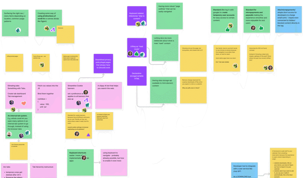
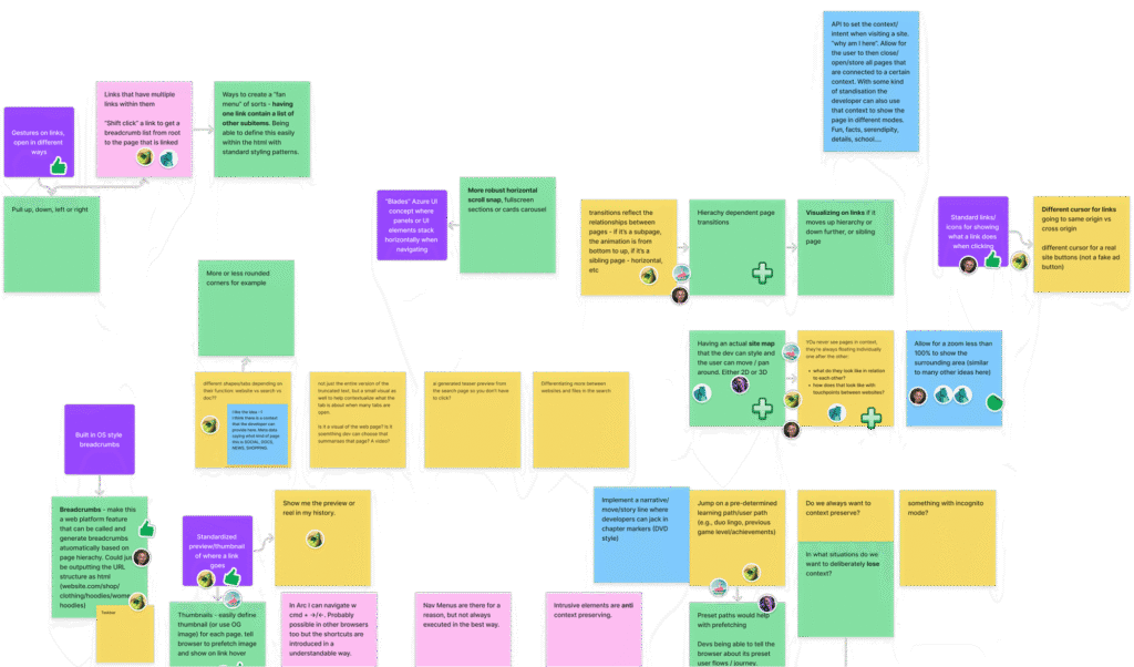
After exploring a wide range of ideas, we identified two core concepts worth developing further:
Tab Knowledge
From comparing products while online shopping to saving articles for later, tabs help us organize our browsing. Tab Knowledge is the concept of same origin tabs knowing about each other and working together, providing a more seamless experience.
Page flow
Unlike a social media feed, a website has a clear endpoint – once you scroll to the bottom, it’s done. Page Flow enables developers to easily transition users to the next logical step when they reach the bottom of the page.
Viability testing
To test the viability of these concepts, we prototyped and iterated quickly, layering experimental UI on top of real-world sites to test how developers could gain new affordances.
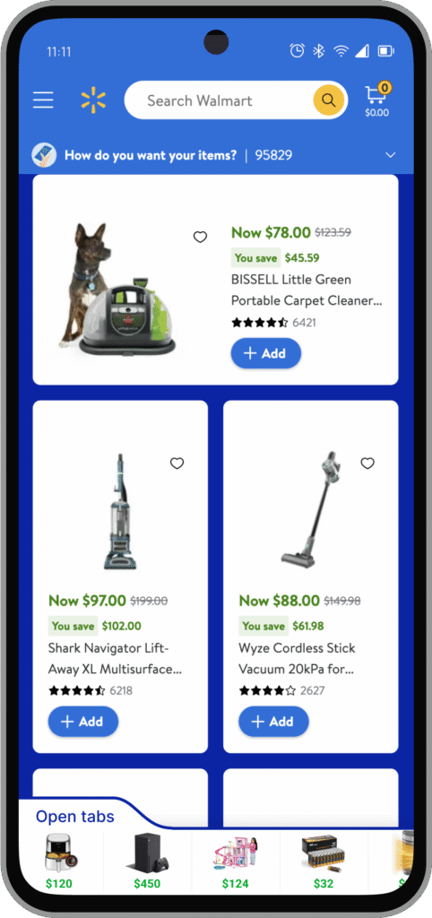
Mockup examples of real world use cases for new navigation concepts. E-commerce websites could provide quick access to open tabs to enable seamless navigation between them. News sites could let you use your open tabs as a reading list. Media sites could let you scroll into related content seamlessly.
Communicating concepts clearly
With these experiments serving as proof of concept, I then focused on building minimal, interaction-led animations that cut through complexity and clarified intent. The animations were kept intentionally stripped-down, making it easier for the client to communicate ideas internally. Material Design colors and assets were leveraged to further ease the use of these animations in internal presentations at later stages.
Minimal UI animation, styled in Google’s Material Design language.
Visualizing Page Flow
Outcome
The project concluded with strong engagement from the Chrome team. The final delivery was praised not only for its polish and pace, but for landing squarely in the “sweet spot” between feasibility and innovation.
“We wanted to make sure we’re in the sweet spot between achievability, and doing something that actually makes the web better. And I think you’ve done a really really good job of responding to that.”
— Chrome Web Platform Team, Google
These concepts are now informing ongoing standards discussions – opening up new ways for developers to shape smoother, more intuitive navigation across the open web.