Process
Research
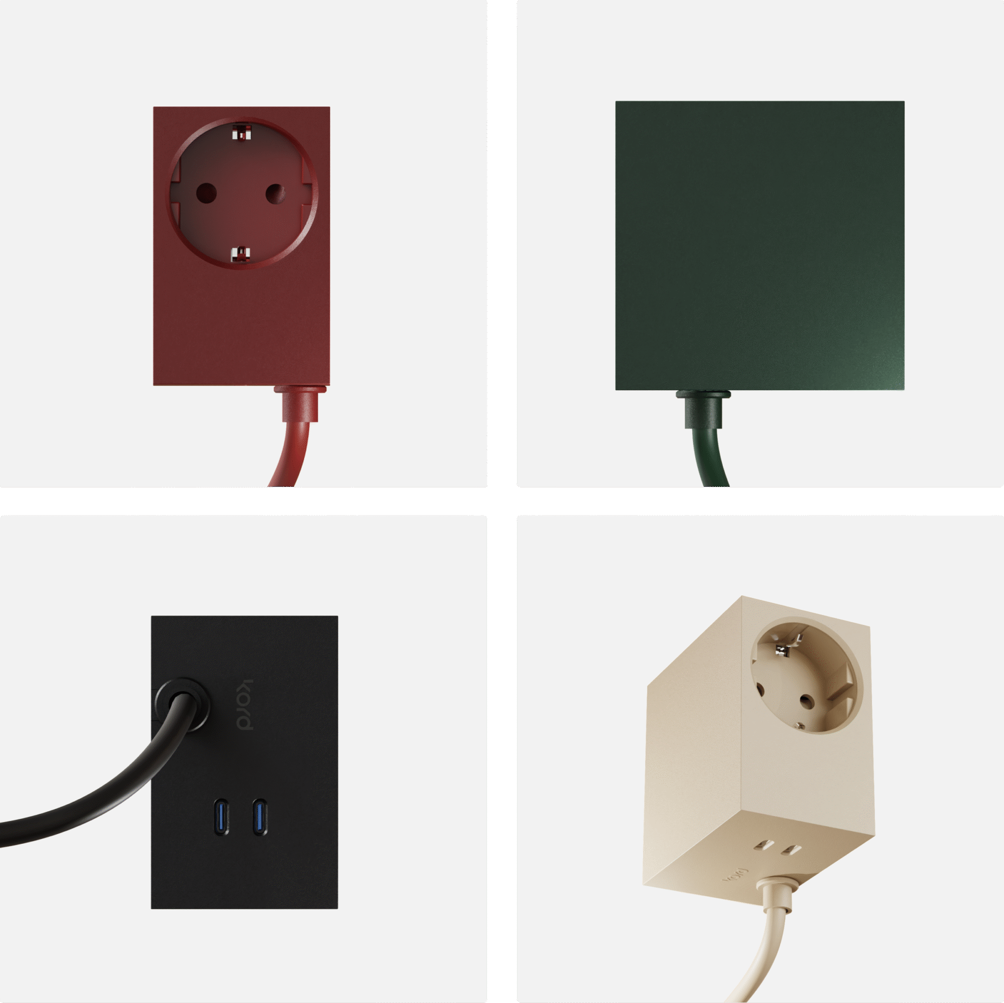
I started by studying how similar premium accessory brands presented their products. Almost all of them leaned on the same formula: lifestyle photography, lots of interior context, creating desirability through association. The problem was, once you removed the logo, you couldn’t tell who was who.
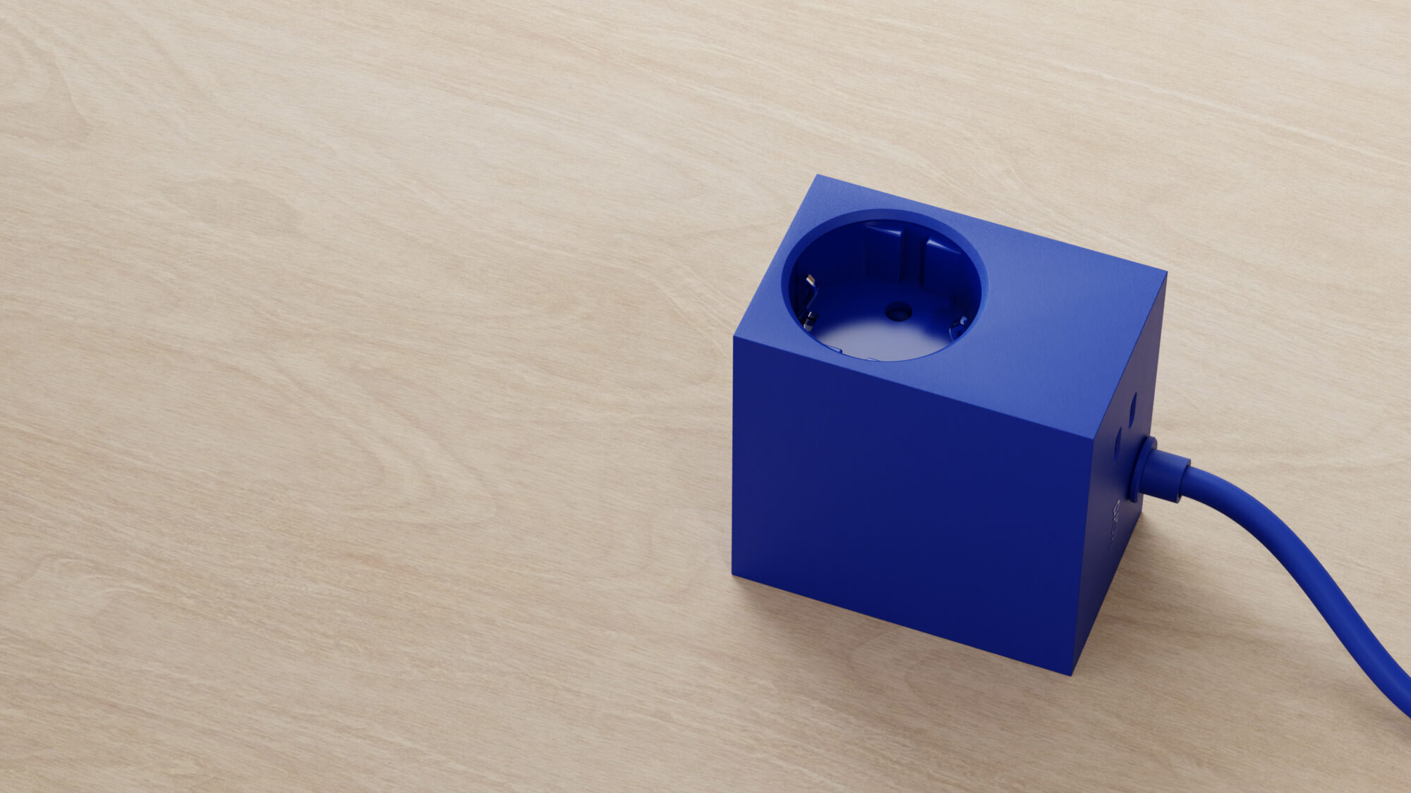
That’s what pushed me to strip everything back. Instead of blending in, I’d make the Cuboid+ stand out by isolation, treating it more like a designed object than a household accessory. The art direction became clean, minimal, and product-centric: think close-ups, shallow depth of field, soft light, and clear reflections that emphasized material quality.
The campaign
I took this aesthetic and created short product animation clips that were cut together for the main ad reel that was designed to be looped, and to work well in Instagram’s low-attention-span environment.
Each clip focused on a highlighting the products features: magnetic mounting, compact size, detachable cable, multiple plug angles, etc. The pacing was quick, but since the scenes were intentionally made very minimal, they remained scannable.
This main reel was combined with alternative takes using some of the existing imagery, as well as carousel ads that were completely image based. The ad sets were then A/B tested to find the best combination of media and copy.
Webshop vision
While developing the campaign, it became clear that KORD’s web presence was holding them back. It was visually busy, with lots of overlapping images, inconsistent layouts, and repeated product photos that didn’t explain the differences between models. The result was a confusing shopping experience and unclear positioning.
I helped them sketch out a new vision for the webshop, one that starts by telling a story instead of dumping products. The structure I proposed puts each product’s unique features front and center, supported by simple, consistent imagery and a more guided flow through the product range.
The sketch was meant to show possible direction, look and feel, not to represent a final design.
Outcome
Once the ads went live, things started moving fast. The reel did exactly what we’d hoped – they stopped the scroll. People actually watched, clicked, and most importantly, bought.
Over the 30-day run, the campaign pulled in a 4.54% click-through rate and a CPC of just 3.27 kr. Orders in the web shop went up by 80%, and sessions rised 706%.
The project also led to a shift in mindset at the Kord team – they saw how strong their product could come across on its own, and not only by association to a styled interior.
Campaign metrics
Cost per click
3.27 kr
Click through rate
4.54%
Web site sessions
+706%
Web shop orders
+80%