Process
From the start, I wanted the brand to rest on three main ideas: honesty, vulnerability, and unexpectedness. Honesty, in the sense of being transparent about what the products were and what they weren’t, no inflated sustainability claims or lifestyle preaching. Vulnerability, as a way to reflect the fragility of both people and the planet, and to let that sensitivity show instead of hiding it behind branding polish. And unexpectedness, to deliberately steer clear of the predictable visual language of “green” brands, and build something that felt more human, less templated.
The first step in getting these messages across was the name.
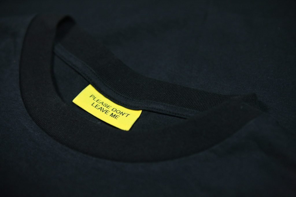
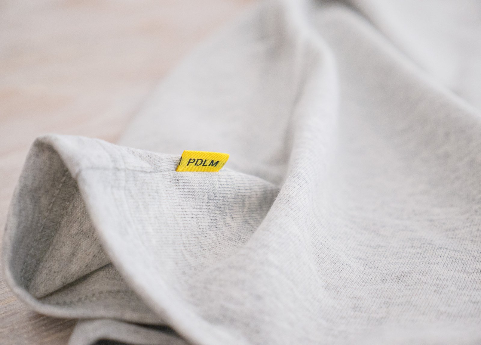
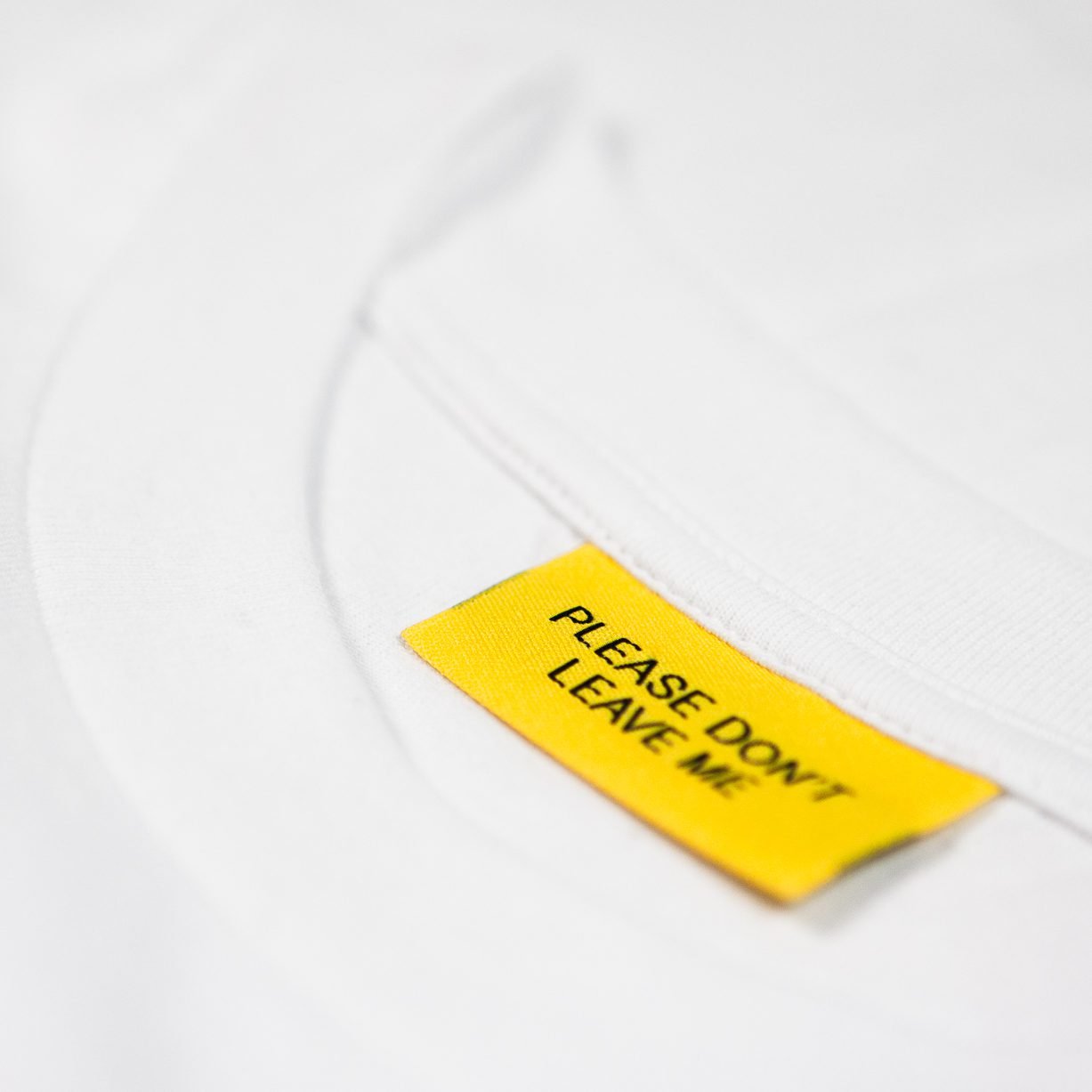
Almost uncomfortably needy, yet very much in line with the key concepts, the name Please Don’t Leave Me stuck out as a clear candidate. The wordmark is set in a slightly thickened version of the almost mundane Arial, all in uppercase to give it the feeling of a late night caps-lock text message. Underlined by the bold yellow color, it seems as much a call to action as a call for help.
Manufacturing with intent
Rather than chasing low costs, I prioritized proximity, transparency, and consistency in production. The goal was to build a supply chain I could actually visit, understand, and stand behind. Working with partners in southern Europe made that possible, allowing short transport routes, strong worker protections, and traceable material flows.
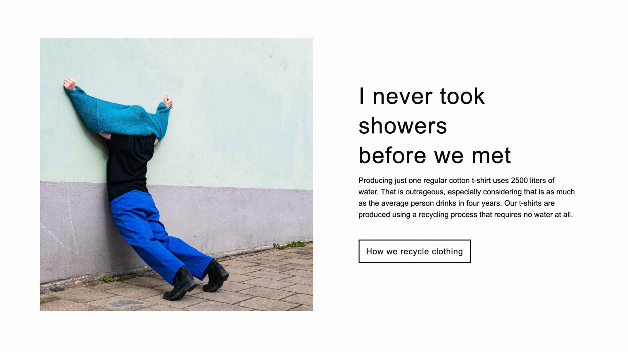
The fabrics themselves were developed from recycled fibers sourced through an established textile recovery network. The challenge wasn’t just finding sustainable materials, but ensuring they met the quality expectations of a premium everyday garment.
The recovered fibers are then combined with recycled PET plastic to add back lost strength. This new material is then spun into a yarn which is used to make new clothing.
Communication and imagery
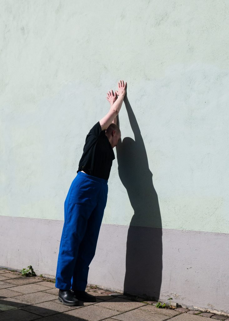
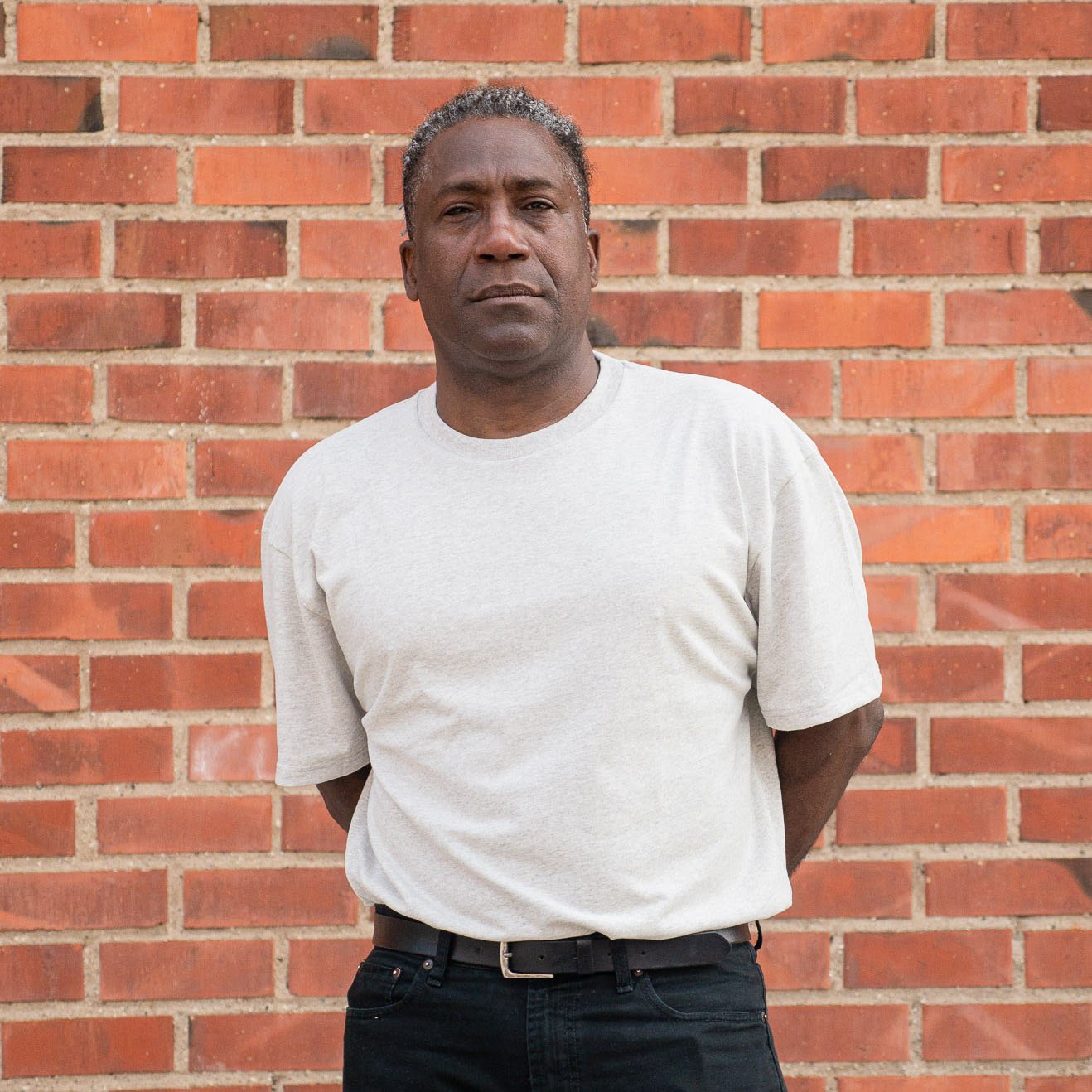
For the visual direction, I wanted to sidestep the usual minimal-eco tropes and emotionless fashion poses.

Drawing inspiration from photographer Arielle Bob Willis, the photos instead focused on character, awkwardness, and intimacy rather than perfection.

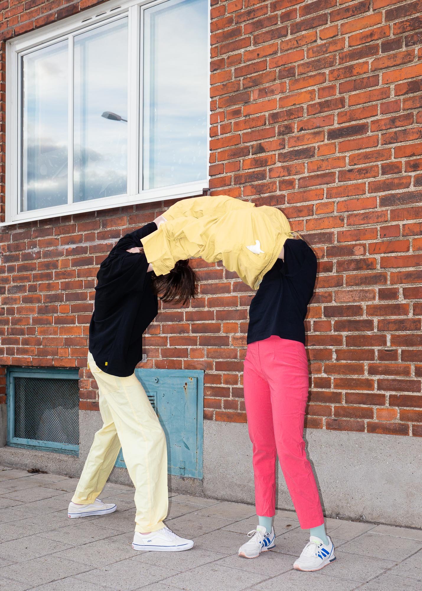
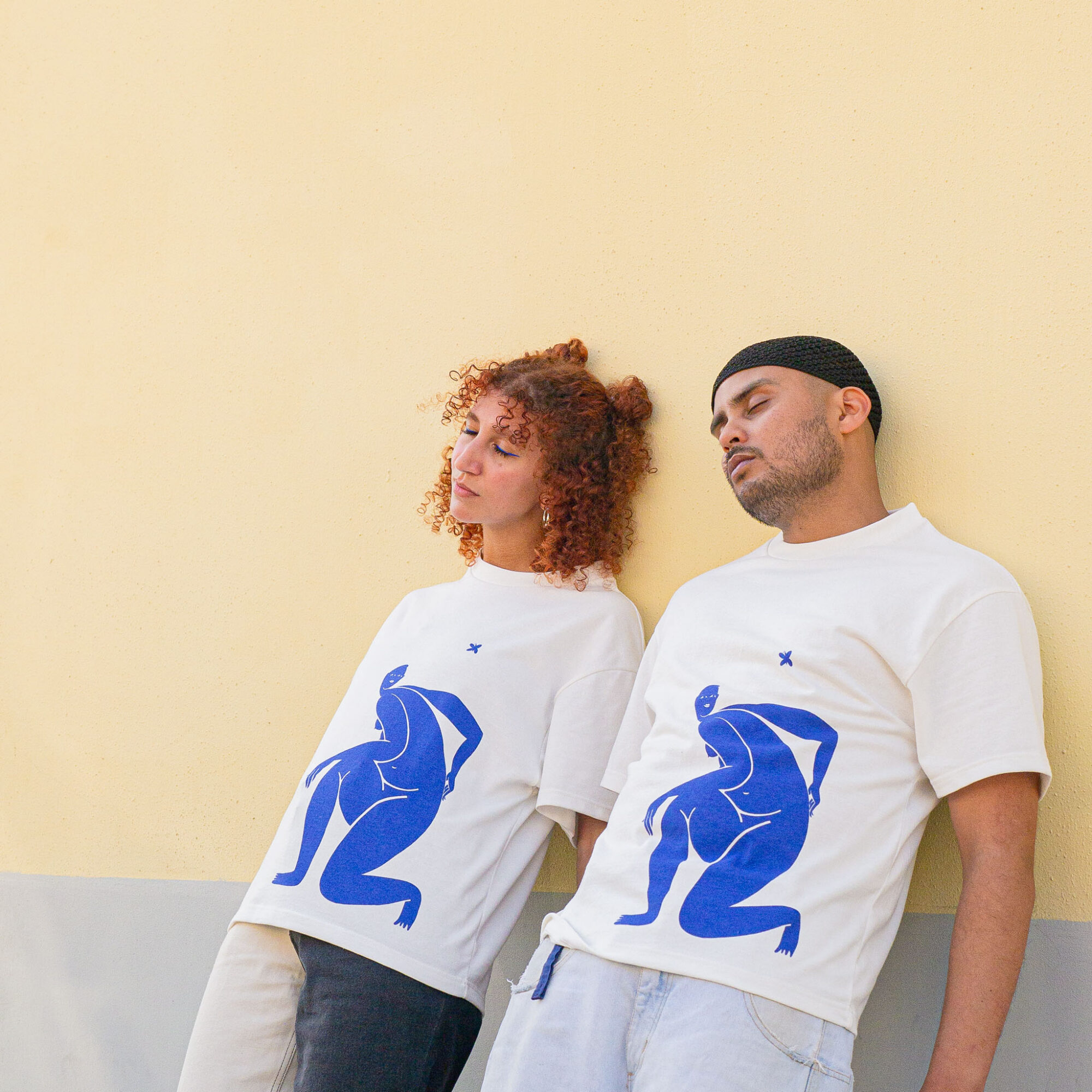
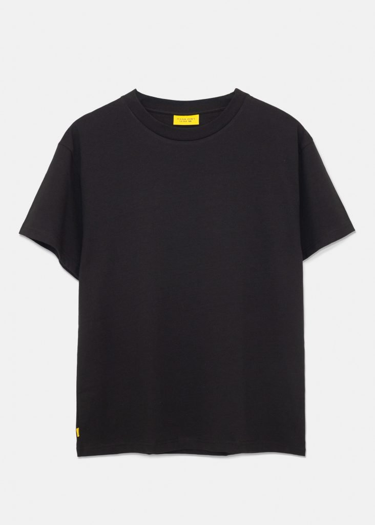
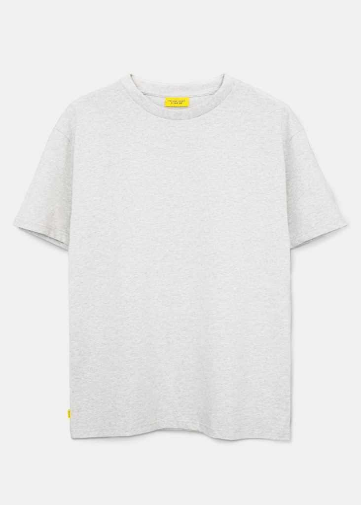
These shots served the purpose of setting the mood for the brand, but they did not showcase the details of the products. To remedy this, I made sure to photograph the products by themselves in a more classic fashion in order for customers to get a better feel for the fit and finish.
Outcome
Please Don’t Leave Me became a study in how sincerity can live within fashion without irony or greenwashing.
The project grew from a single product line into a functioning brand, complete with production partners, visual identity, and an online sales platform.
Though the shop remains online, the brand is currently on pause while I pursue other projects. The experience continues to inform how I think about material honesty, emotional tone, and storytelling in physical product design.